So you have family photos coming up and you have no idea what to wear. Not to worry.
I get a lot of questions about outfits for photos & it’s something I love helping with!
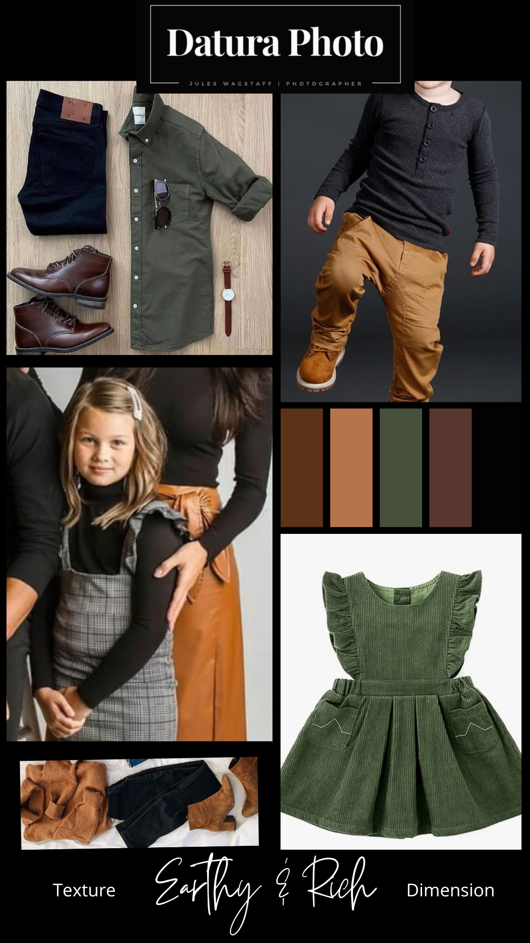
I’ve put together a detailed post going over color palettes, how to achieve balance with outfits, and visual explanations of what works well in photos. Most of these are for fall (how is it already September?) and I’ll do more in the future for others.
Let’s get into it!
Keep the location in mind
Some locations won’t be good for bold and bright colors. Some will be really busy and compete with you. What season is it? Will the scenery have grass and trees? Will it be neutral? Will you be downtown with architecture? Bold brighter reds can look amazing against a black urban building, but wouldn’t work in most situations.
Don’t go crazy with patterns. Solids are your friend.
Focus on color, texture, and dimension. Busy patterns will compete with your gorgeous face and the location. That said, patterns like plaid, floral, etc. Can still work, but I wouldn’t put more than ONE person in a pattern. And make sure the pattern colors won’t distract from your face and the other people in the photo, as well as the location. I know, this is a lot of information. But trust me. Patterns and denim are adorable in everyday life at school and work, but they are not as photo friendly. You want to be able to focus your attention on various elements in your photos, and competing patterns will be distracting.
Choose mom’s outfit first, then coordinate with complementary colors for everyone else.
Mom is probably the one planning photos, so we’re gonna give her first outfit choice. Personally, I will either choose my daughter’s outfit first or my own outfit first, and then plan around those.
Let’s do an activity.
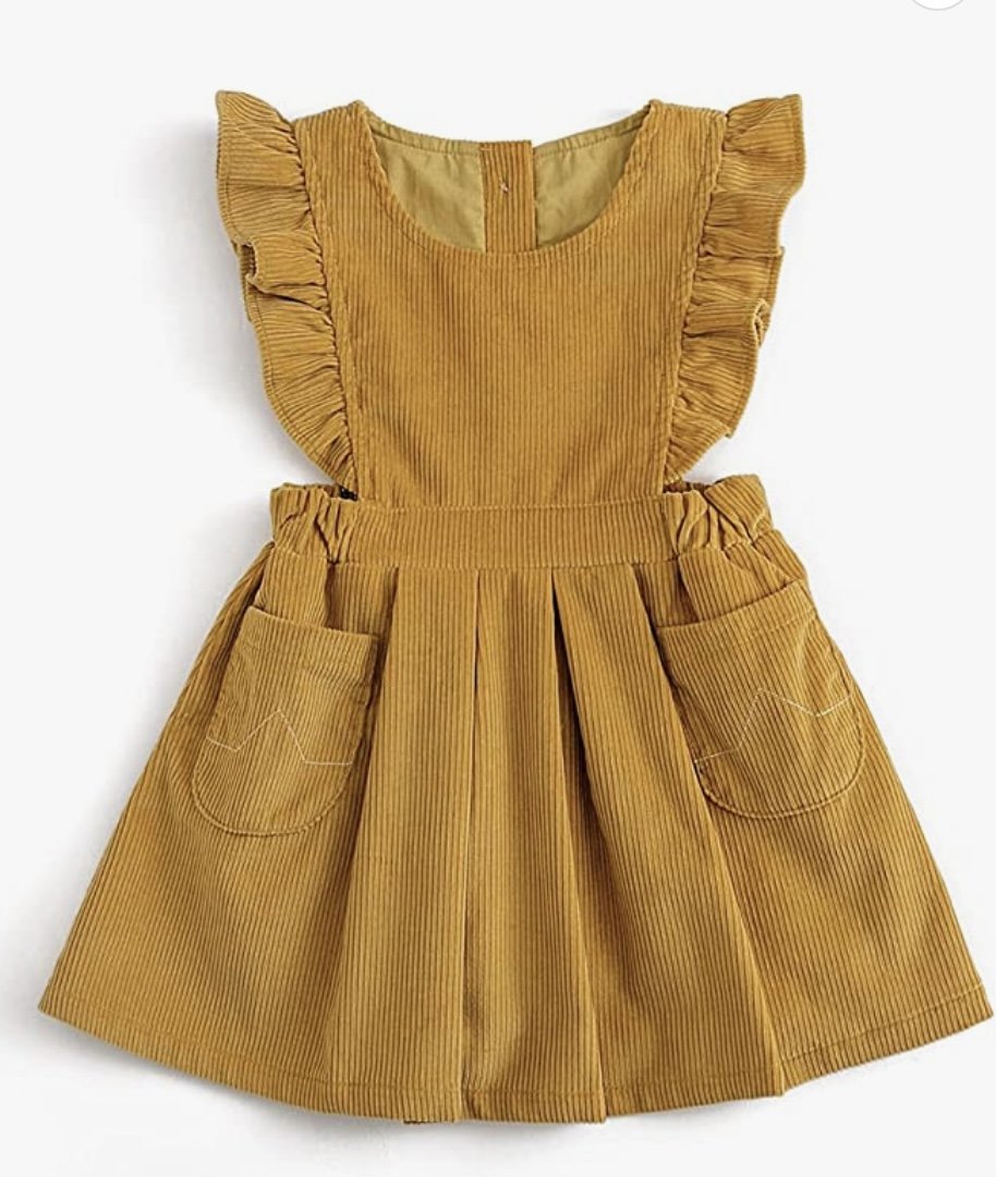
If this mustard dress is our “base” outfit, can you choose complimentary colors to go with it? The location is in the mountains with fall colors.
I feel like a lot of people are good with colors, but I’ve realized it comes easier to some people than others. Complicated algebra never clicked for me. But color coordinating luckily clicks for me. It comes in real handy as a photographer 😅 I remember working at a retail clothing store & customers being shocked that the colors I found for them looked so good. I realize this is a total not-humble-at-all brag, but basically, I gotchoo. I love playing with colors.
What colors did you choose to go with this outfit?
For me, right off the bat, I would say we need some subtle olive green, cream or white, and dark brown to help balance and tie everything together.
Something like this:


What did you come up with?
How I then plan everyone else is kind of.. intuitively. I visualize what would work well and go from there.
“Ok then my husband will wear his dark khaki pants that will pull those tones, I could do a cream button down on him, I look for a green dress or outfit that pulls olive tones for me, my son will be in olive or greenish grayish pants and a tan/brown shirt. We could throw in a tan hat on me or my daughter, they could do brown shoes or converse…” etc etc. But It’s all visual, I literally just picture us wearing certain outfits and colors.
Once I’m pretty sure on what I want, I’ll look up more ideas for outfits, search for things I envisioned, and keep my eyes peeled at stores. Sometimes I change my mind on the “base” outfit if I’m not digging the vibe while I start planning.
How I make final decisions is like this:
Choose base outfit
When planning your own, find a few that you like, and ask yourself: would I like it on my body/would it be flattering on me? (There are plenty of dresses I love that look great on the model, but I know they wouldn’t work for me.) Would this length work for me? And does it show off my best features?
Move to the next outfits. Ask the same questions for everyone else. Do you (& they) like it? How would it look on their unique body? Will it be flattering? Will the color look good on them? And will it work with the other tones?
Make a little document with ideas to use as a visual, or come here and look at mine 😜
Try on. Make sure you love. Buy! Or do what I do and order a couple online and keep the one(s) that works best.
I like to play around with colors & if I’m not loving it, I might ditch a color. Like this:

Not feeling the burgundy this year & want to stay more neutral. So I would redo it like this:

Then I start shopping and make final decisions based on what looks best on everyone! If you’re not buying new clothes, do the same thing but using clothing you already have. But pro tip: newer clothing does photograph better.
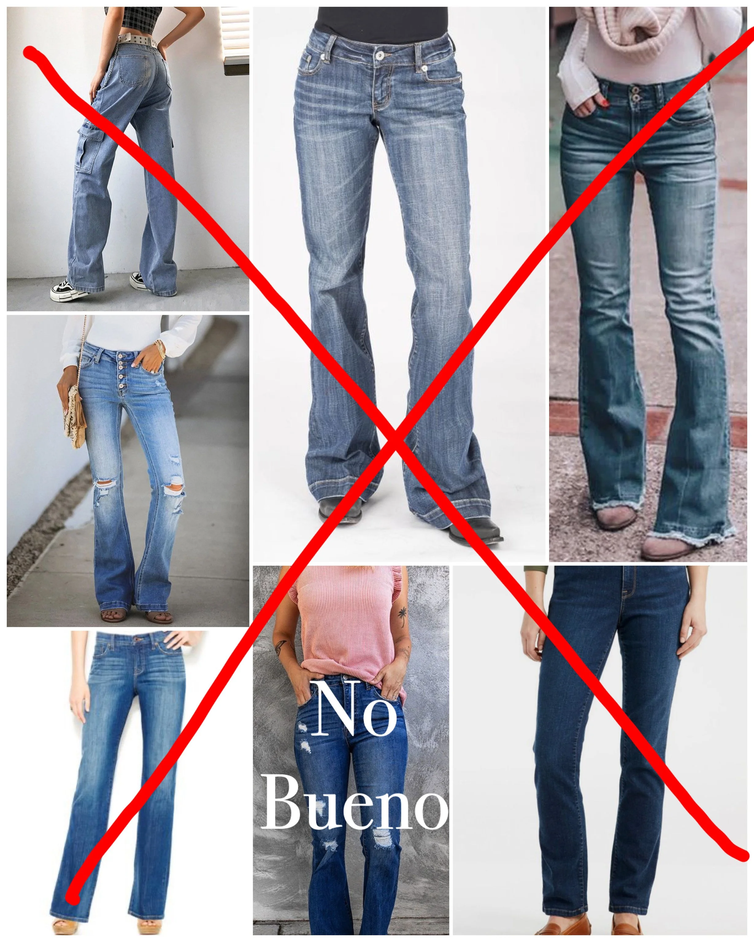
Cotton T-shirts and blue jeans can look sloppy and aren’t that photogenic
While I don’t recommend jeans for photos, if you are going to wear jeans in your photos, be careful choosing the color of your denim. And don’t put everyone in blue jeans. I repeat. Do not put everyone in blue jeans.
If you absolutely have to and have nothing else, keep the rest of your colors as neutral and simple as possible.
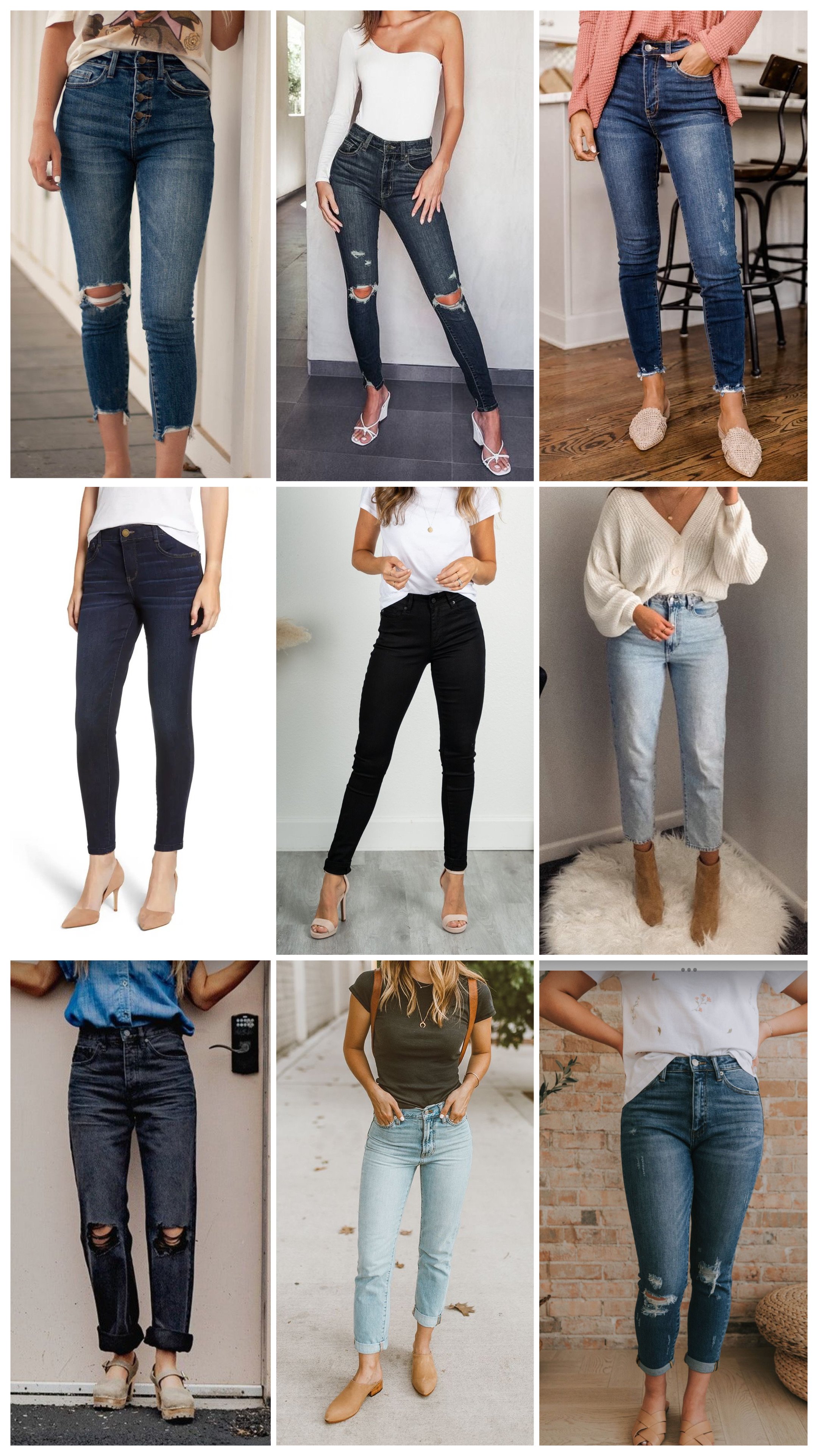
If you’re doing jeans, some look better in photos than others.
This style photographs best, although you’ll still want to keep your top and shoes neutral if you wear jeans.
These jeans do NOT look so good in photos. They’re just very… blue and denim-y. And distracting. Remember, bring the focus upward to your face. You don’t want any clothing that is so distracting it takes away from that.
Clothing can look different in natural outdoor light then it does in the mirror at home.
Do a check outside in the shade and in direct sunlight to make sure you love the way your outfit looks and fits on your body. The next tip is for you if you notice any distracting squishy parts of your body that are catching more light and hugging parts you’d rather not show off.
SHAPEWEAR WILL KEEP YOUR LOOK BALANCED
First, I have to say, I do not body shame, and your body is a work of art no matter the size. However, I DO recommend shapewear if you’re going to wear anything form fitting and you notice any “rolls” or indents/seams tucking, because it will keep everything balanced so that when you look at your photos, you will look at your face, and not be distracted by body parts catching more light than others. Really what we are doing is making it so your entire stomach catches the same amount of light and shadow, and you’ll feel less self conscious.
Personally, I feel like a lot of shapewear is SO constricting and I can’t wait to get it off, so my preference is the shapewear underwear that just compresses the lower stomach. Use your own disgression and comfort level based on the outfit you’re wearing. I only wear it if I’m in a form fitting dress and parts of my stomach look… squishy.

There is nothing, I repeat nothing, wrong with the woman’s body in the first image. However, I guarantee you will be happier with your photos if you wear shape-wear. This only really applies to anyone wearing form fitting material that hugs parts of your body that distract from your face.
Match your photographer style with your own
If your photographer edits with moody or rich tones, moody rich colors look best. If your photographer edits with bright and airy tones with bright green trees and bright green grass, lighter pastels will look great. If they put a super yellow filter on the pictures and you can’t tell what the outfit colors were originally, I don’t know what to tell you 😂 consult with your photographer or hire me instead. (Wink wink).
Don’t be afraid to ask for advice
Most photographers, myself included, always want as much information from you as possible! Send your photographer a picture of everyone being photographed if you won’t meet in person before your session. What are you most comfortable wearing? What makes you feel sexy but also yourself? What does your house look like? What kind of things are you into? What are your favorite movies, do you binge watch crime shows, do you lock yourself in the pantry with cookies to get a break from your children, do you appreciate art, do you have tattoos, do you need to cover garments in your photos, do you read full paragraphs on websites about clothing colors for photos? Yeah. Like. Let us into your world. It’s easier to make magic in the photos when we can connect with you and know who you are.
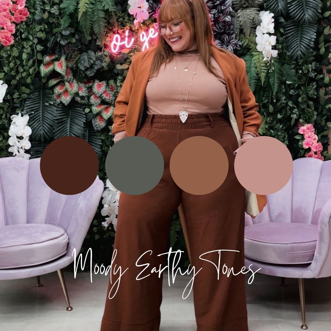
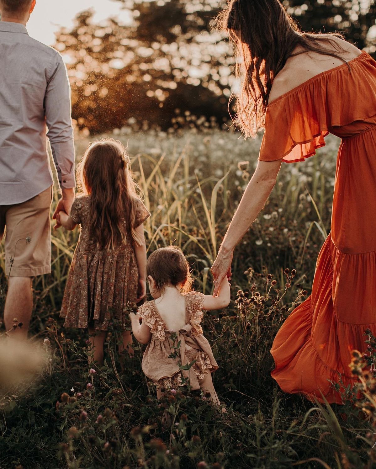
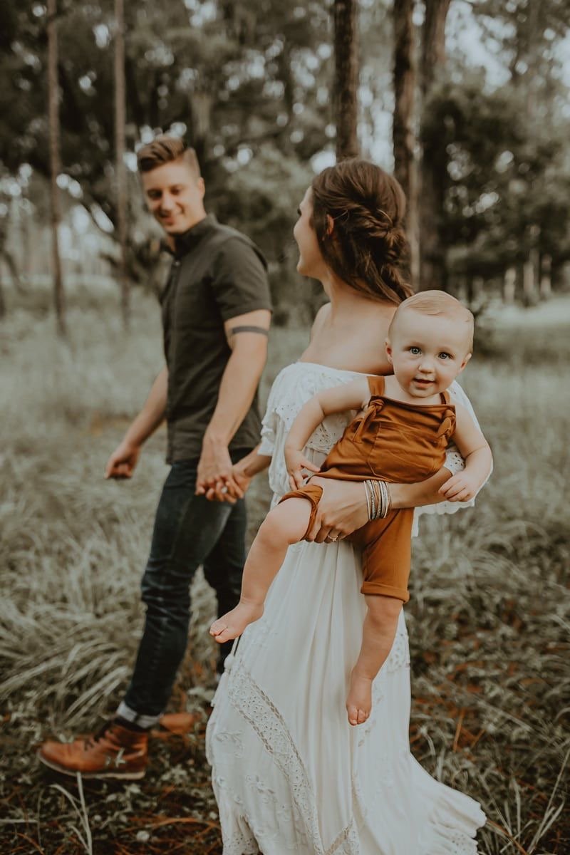
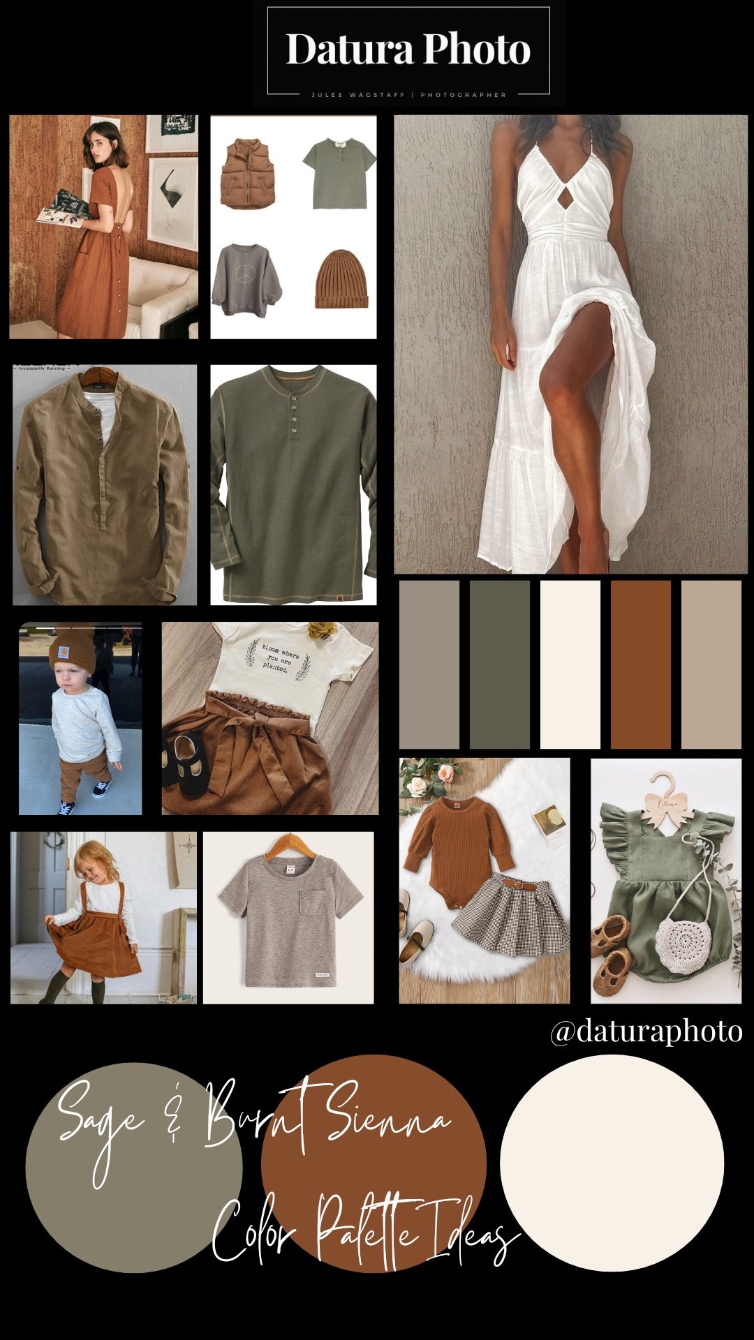
Have a look at Some beautiful color palettes


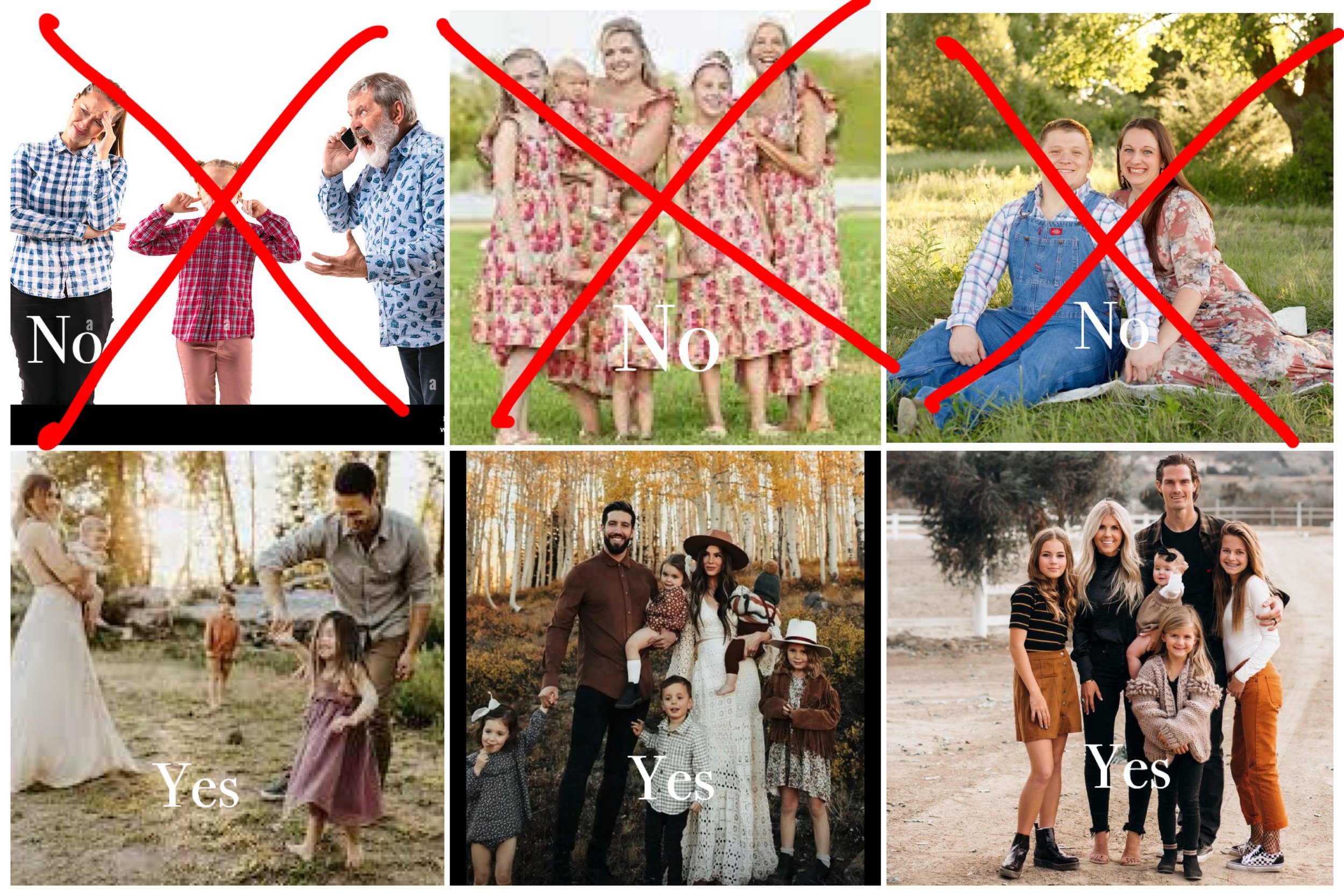
LETS GET OUR GRADE ON
The following photos are NOT my photos, I would never shame my own clients. (I mean, nor am i shaming these guys).
I’m going to give these next outfits a letter grade so you can get an idea of what outfits work best in photos. The grade will be below the photo.

B-
Everything EXCEPT dads shorts is perfect. But dads shorts make such an impact that it took the grade down. If his shorts were the same color and style, but pants, it would be a B+. If he had black pants and shoes that weren’t so athletic looking, it would be an A-. If the daughter then also had a headband that didn’t have a pattern (since her outfit has a pattern), it would get an A.
B
Same thing here! It’s perfect except for dads shorts! Turn those shorts into pants and these outfits get an A.
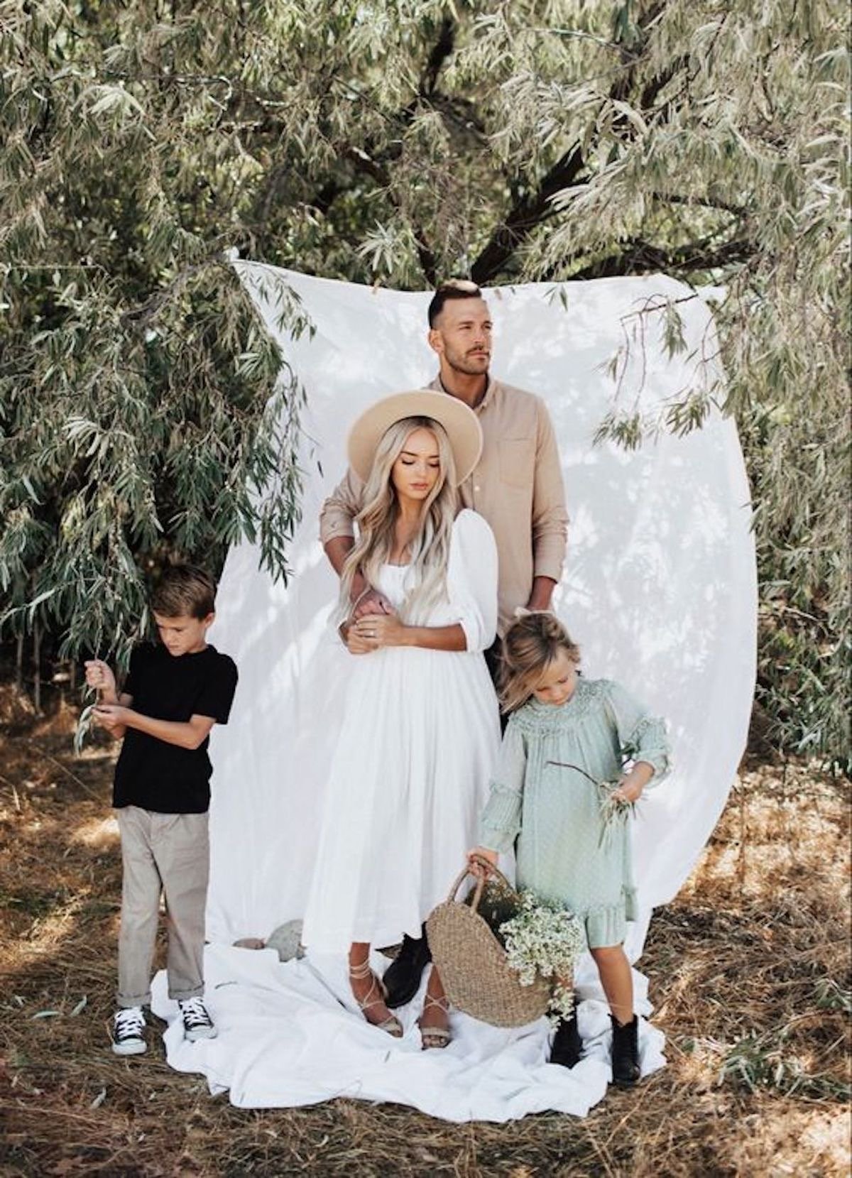
A-
Gorgeous! The only thing I would suggest is seeing how black jeans or chinos look over the jeans. The Jean material and style here photograph well, but our eyes would focus on the elements of the photo better if the pants weren’t as distracting. All in all, this outfit is great, and they did a great job incorporating denim! The photographers style and editing work well with their colors and the scenery as well. I would be stoked if these were the outfits my clients showed up in.
A-
I love! Everything is very balanced, however, it would feel more balanced against the stark white sheet if the boy’s pants matched his dads shirt and if he had a grey shirt on instead of black.

D-
Please don’t show up like this. They are too matchy, they are in a bright color that will reflect on skin tones, and they are in jeans that don’t work well for photos. Also they look awkward and miserable, but this was once the style so we’ll say nothing more and move along.

C+
Much better than the last one! Still overkill on patterns. However, the grey is so neutral that it does provide balance. But it’s also too many pairs of jeans for my preference. I would put a couple kids in black jeans or black leather skirt or romper. I would make sure the jeans had something interesting, maybe a small rip (the kind that is supposed to be there) or maybe black leather pants. Cut out at least half of the plaid and have someone in a hat that pulls a coordinating color (not plaid!)
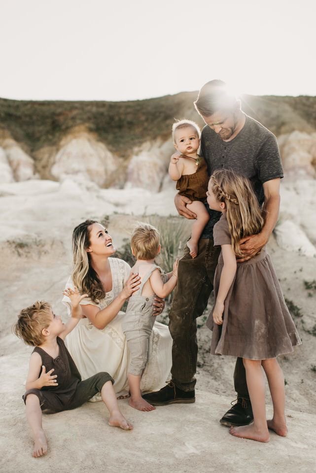
A
The outfits aren’t distracting, they go well with the background/scenery, and my eyes are balanced when I look at the image. There is texture, there is interest, but nothing steals the show. It’s about the family, not the outfits. (Although the outfits are still amazing)

A-
Change the kid on dads shoulders out of those jeans into the same color as his brother and we have an A. Everything is coordinated but not too matchy matchy, and my there is enough interest to keep my eyes happy. If moms dress were SLIGHTLY more neutral that would elevate it as well. But overall, beautiful, stunning, I love.
I hope by putting these examples it helps you decipher what a good outfit would be and what a bad one would be. I could do this for hours, but I think this is enough.
Some additional color palette examples & things to consider:


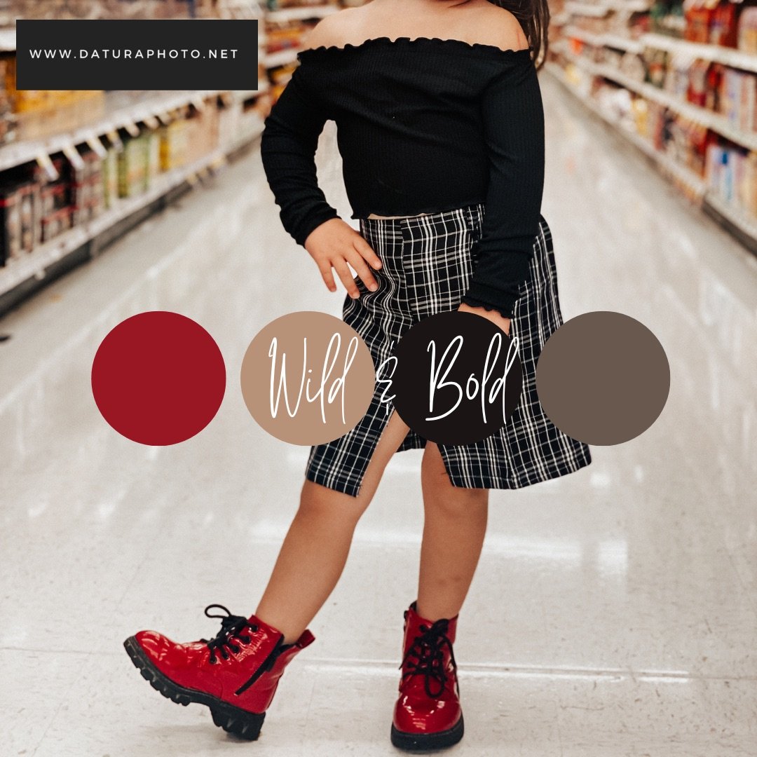
If you’re going to do something bright, like red, be intentional. Unless you’re doing Christmas photos, I would avoid bright red and opt for dark reds, burgundy, etc. Bright reds and oranges will be reflected on your skin and will be distracting. Instead, have pops of red that are intentional, like these shoes, and you’ll get better results.

These clients of mine did a good job with colors. Less denim would’ve worked even better, but because of the beach vibes, it doesn’t scream overkill.
The example photos below are NOT my original content (I will replace with my own examples soon & update this post), but do a great job at visually showing why certain outfits don’t work as well.
These IMAGES do a great job at demonstrating how to create balance with different LOOKS:


If your clothing is loose on top, balance it with something tighter on the bottom. If your top is tight, balance it with something looser on the bottom. Also, the outfit on the right is slimming, elongating, and helps us look upward at the face rather than the outfit.
More tips:


Draw attention to your face with balance.
If body parts are getting hugged that distract from your beautiful face, create some balance with subtle layers or a loose (but not TOO) loose fit
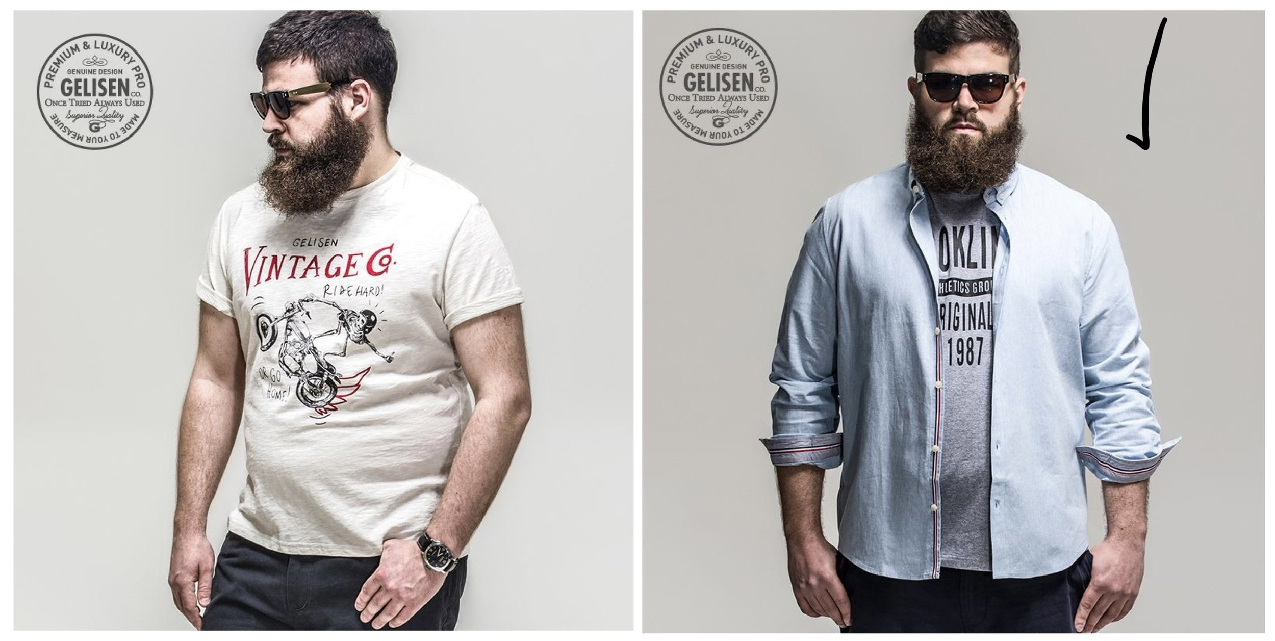
While he looks great in both shirts, in photos an over shirt always works well for guys!

If you want to create balance on the bottom, (especially if you’re on the short side!), make sure your pants aren’t too baggy or long. Ankle length pants draw the eye upward, create balance, and make you appear taller and more put together. And you’ll like your photos better! If you are short, make sure you get a short inseam. No matter your height, if the inseam isn’t right, get them tailored to YOU. Clothing should fit your body, not the other way around.
Was this post helpful?
I hope you learned something, and I know your photos are going to look BOMB now that you know what to look for and what to avoid.
Until next time
xx
Jules